Visuals can shape world views – but not always for the better. Portuguese anthropologist João Figueiredo shared an example how an entrepreneur announced at a conference that Portugal is the centre of the Earth because of his country’s position on a map he presented. This idea is, of course, scientifically incorrect. Unfortunately, this did not stop this notion from being integrated into a Portuguese Government marketing campaign. Maps are factual, so they can’t be political, right? Not so. Maps are created by people and they carry the history of cultures and political ideologies. In this post, we’ll look at the culturally loaded notions of North and South on visual maps, and other representations of science in evolution and science presentations, that have strong cultural authority, even though they are incorrect.

Topsy turvy history of maps
Universally accepted maps show the Northern hemisphere at the top, yet cartography expert Nicholas Danforth explains that the only logic for this is that Byzantine monks and Majorcan Jews first created these type of visual maps (and were eventually spread to other places). Egyptians draw maps with the Southern hemisphere upward, possibly to reflect the flow of the Nile River, and Arab cartographers did the same because they were influenced by Chinese maps. From the 14th Century, as navigational maps started to become more accurate, they included a compass in one corner, although maps still showed different places at the top. In the 16th Century, a more systematic mapping process became diffused, including latitude and longitudinal lines. These were influenced by the work of Ptolemy, an Ancient Greek cartographer from 2nd Century CE Egypt, who always drew North at the top.
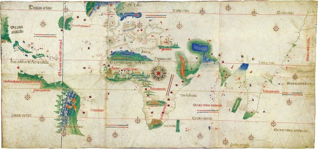
Cut to January 26, 1979, to the launch of McArthur’s Universal Corrective Map of the World (at the top of my post), which shows an “Upside down” view of the world. Drawn by Anglo Australian Stuart McArthur, the map challenges the social norm that European perspectives of the world should dominate. Two noteworthy issues arise. First, the map proclaims “Australia: No Longer Down Under,” clearly centring Australia’s place on the map. Second, the fact that the map was launched on Australia Day, a controversial holiday known as a day of mourning for Aboriginal people, shows that McArthur still promotes an Anglo-Celtic view of Australia. Aboriginal people are known as the world’s first astronomers, with multiple sites around Australia being home to rock art, which act like physical maps. So while the average non-Indigenous Australian will be familiar with the “North side up” map of the world, they may be less familiar with Aboriginal star maps. This is not apolitical.
Mapping cultures
Many people don’t understand that maps are merely one visual representation of the Earth, amongst many. But the legacy of maps has figuratively shaped global discourses.

When we talk about “Western culture” and “Eastern cultures” we are, in fact, reproducing early European ideas that Europe was at the centre of the world. “Western cultures” were positioned as superior to Others. This process is known as Orientalism. Edward Said has given a historical perspective of how this bears out in modern-day relations.
Sociologist Stuart Hall developed this idea further in his West and the Rest thesis. Hall notes that arbitrary geographic positions became linked to dichotomous notions of culture (West= advanced; East=uncivilised). These ideas then became embedded into how we think and talk about global relations in the present day.
There is, in fact, no such thing as “Western” culture, as American culture is different to Australian culture and British culture. We understand this in “the West.” Yet people in “the West” don’t always accept that “Eastern cultures” are fundamentally not the same. We lump “Arab” and “Asian” groups together, even though Arab-speaking nations are typified by their diverse cultural, linguistic and religious traditions. Similarly, countries in Asia do not have unified cultures, let alone a singular “Asian” language.
We see similar mishaps with other famous images, that take on a life of their own, confusing the public about scientific matters. One famous example is the depiction of the “evolution of man” from 1965.
False picture of evolution
Anthropologist F. Clark Howell used an illustration to simplify the process of evolution. This image depicts Homo Sapiens on one end (modern humans), and Pliopithecus at the other end (an extinct primate). The original image includes 15 species and it was titled, “The Road to Homo Sapiens.” The popularised image we all recognise as “The March of Progress“ only includes six species.


Howell stated that the picture was not to be read as literally depicting a linear evolution of one species to the next. Still, this image is often misused by Creationists to create confusion about the process of evolution. You’ve heard the unscientific arguments (If we came from monkeys why are there still monkeys?). Howell later said of this image’s legacy: “The graphic overwhelmed the text. It was so powerful and emotional.” SciShow (below) have a nice discussion on the scientific errors of this image. For starters, a man is used as a proxy universal for humans (the image even reads “modern man“). Some of the species depicted have since been reclassified, and so on.
The problem with images is that they seem seductively simple, making ideas seem fixed and complete to the untrained eye. Science is an evolving process. Our knowledge of processes are constantly being enhanced. Yet once a scientific image permeates popular culture, it is difficult to rectify the poor scientific assumptions they engender. This is why we see people thinking that the globe perfectly matches the 2D image we’re accustomed to seeing, or the idea that evolution ends at the present time, with “modern man.'”
Off the (power) point
Maps and other diagrams are helpful schemas that enable scientists to communicate complex ideas more simply, but these representations are sometimes misunderstood or they take on other meaning in the public imagination. So much so that they can be counter productive, to comical and catastrophic scales.
As some of you may know, I’m a big advocate of visual science, but I’ve also done a lot of research and written of the problems with visual representations of science. Images give the illusion of simplicity and so they can be misinterpreted, mis-communicated across cultures and misused.
Edward Tufte is great in this area. He has used the example of how NASA’s senior team mismanaged a PowerPoint presentation, leading to a disastrous miscalculation. Tufte sets the scene: “During the January 2003 spaceflight of shuttle Columbia, 82 seconds after liftoff, a 1.67 pound (760 grams) piece of foam insulation broke off from the liquid fuel tank, hit the left wing, and broke through the wing’s thermal protection.” The shuttle orbited Earth for two weeks with an undetected hole in its wing and consequently burned on re-entry. How did this happen? Human error coupled with organisational biases towards a particular visual representation (so, human error squared). PowerPoint is a widely used organisational tool to convey important data. It is flawed as we have become accustomed to read fonts and bullet points in ways that narrow our attention. Tufte writes:
“Imagine you are a high-level NASA decision-maker receiving a pitch about threats to the Columbia. You must learn 2 things: Exactly what is the presenter’s story? And, can you believe the presenter’s story?”
Conventions of PowerPoint visual representation in science led to oversimplification that might be useful when presenting to some external audiences, but not for technical staff. Tufte notes that each NASA slide uses bullet points of four to six levels of hierarchy (see image below). Each point seemingly fits on one slide. The order, sequence, indents, font size and style of bullet points tell a visual narrative that ranks the order of importance of each data point. ‘The format reflects a common conceptual error in analytic design: information architectures mimic the hierarchical structure of large bureaucracies pitching the information. Conways’s Law again.’ Conway’s law states that: ‘organisations which design systems… are constrained to produce designs which are copies of the communication structures of these organisations.’

Tufte explains that an investigation found that the “distinctive cognitive style of PowerPoint reinforced the hierarchical filtering and biases of the NASA bureaucracy during the crucial period when the Columbia was damaged but still functioning.” The Board ruled that engineering requires better visual tools, and that technical reports are better than PowerPoint.
Drawing better conclusions
Tufte argues that the way to control for visual misrepresentations is to train scientists about the cultural meaning of images and symbols. He suggests not all scientific ideas can, or should be, “translated” into visuals.
More broadly, being more aware about how images can be misinterpreted is central to public science education.
Notes
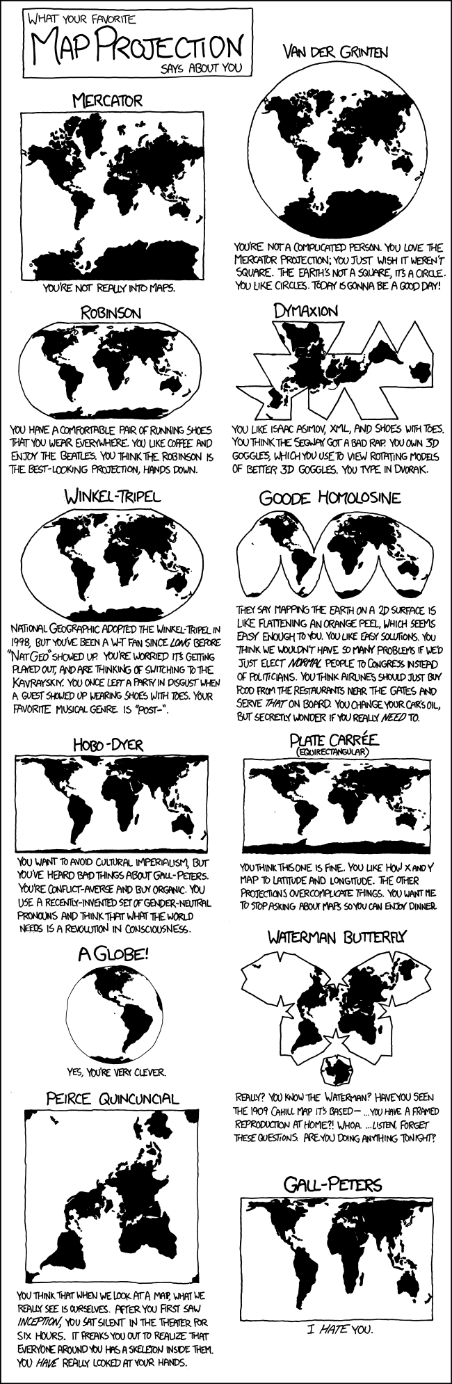
I’ve added a couple of extra visuals to my post. Thanks to Michael Verona for reminding me about the xkcd comic.


So all these memes floating around the Web aren’t all true!? I can’t get all my important facts from individual PowerPoint slides taken grossly out of context that may leave out some important details for the same of simplification at best and outright misrepresentation at worst?
Well damn, that’s disappointing. LOL
Now to be serious: a well-written article that should be required reading for everyone on social media, which means most everyone using a computer or smartphone probably. The unbelievable proliferation of communications media that prize brevity over thoroughness has had unintended consequences. People seem to be losing the ability to think deeply and critically.
LikeLike
Charles Payet Thanks for you comment! I think that memes are an especially important area for scientists to pay attention to. Almost every time I see a science meme I think: #NeedsMoreScience The image sometimes misrepresents the science. The stats quoted need caveats (30% of people say “Science is Wrong” – really? 30% of how many and how was the study carried out?) Other times the words are just plain incorrect. (Don’t get me started on those vacuous Einstein quotes citing things he never said!)
Infographics and memes are obviously strong marketing tools so scientists should work out a way to take control of the message by producing our own factual images. I know some people complain that scientists are already expected to be many things: researcher, educator, public communicator, blogger/social media guru. I’m adding visual communicator to the list. But the times they are a changin’, so we must adapt!
LikeLike
Great post, as always Zuleyka Zevallos!
Between the rise of infographics and the introduction of “common core” mathematics I’m seriously considering labeling Idiocracy as prophecy instead of entertainment, and moving my $20 bet on the end of human existence from “global pandemic” to “not sufficiently intelligent to breathe unassisted.”
On a brighter note, here’s the obligatory XKCD: http://xkcd.com/977/
LikeLike
Michael Verona Thanks so much for your comment! Your humour mixed with scepticism is always so amusing! Ahh yes how could I have missed this xkcd, it would have been perfect to add! I did consider adding the VSauce video too (http://youtu.be/2lR7s1Y6Zig).
LikeLike
Zuleyka Zevallos – Thanks, I’m happy to help! If I can’t be a scientist, I can at least be weird. Also, I hadn’t seen that VSauce video before – it was cool!
Now I need to find food and sleep. Or just sleep. Or something.
LikeLike
Glad you liked the vid Michael Verona! Sleep well.
LikeLike